Project 3 of 4
Storefront study
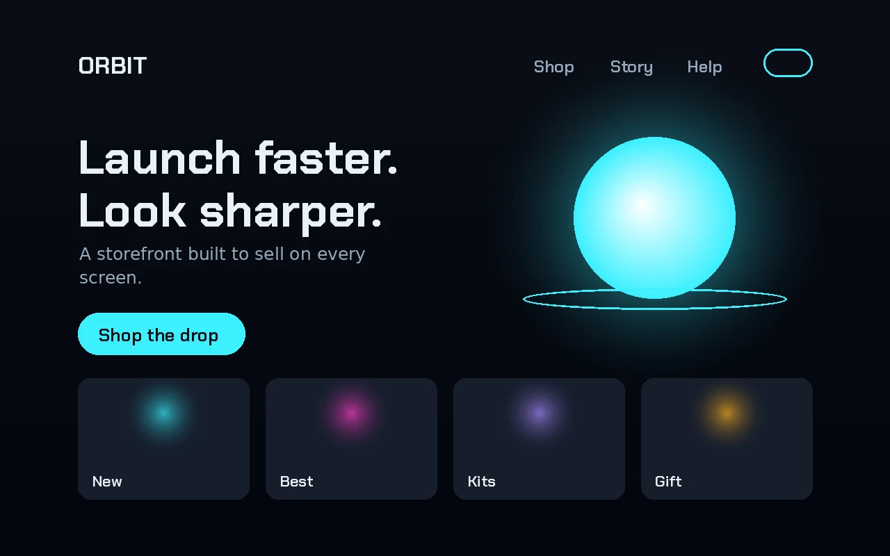
A design study, not a client project
scroll to see three brands
The idea
One storefront layout, dressed for three very different brands.
- What it is
- A design study by NLY Media
- The brands
- ORBIT, harbour and SOLACE, made up for this study
- Stays the same
- Header, headline, call to action and a row of four category cards
- Changes
- Colour, imagery and the words
- Made by
- The NLY design team
One layout. Three brands.
dark and electricOrbit
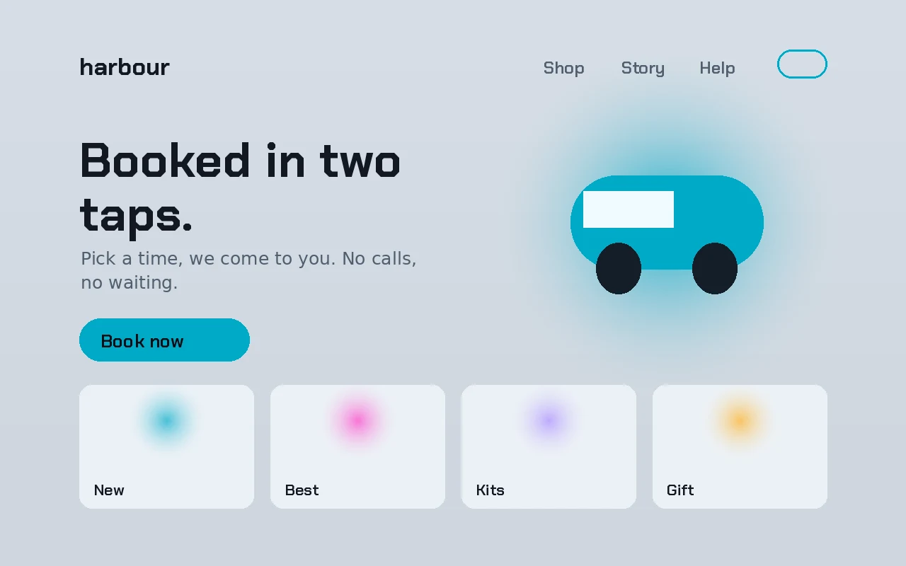
light and calmharbour
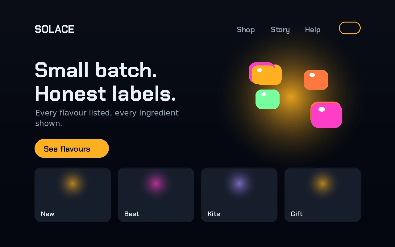
warm and glowingSolace
What it shows
- LayoutThe same grid and the same parts in all three. Build it once, dress it many times.
- ColourDark and electric, light and calm, warm and glowing. Colour does most of the brand work.
- Words"Launch faster." "Booked in two taps." "Honest labels." Each headline talks to its own customer.
made in-house to test an idea, no client attached
Your brand, next.
Tell us what you sell and who buys it. We will design a storefront that only your brand could own.
Start a projectNext project
Design system a design study Open the next one